How to Make iPhone Pictures Look Professional Without Fancy Gear
Discover how to make iPhone pictures look professional. Our guide covers settings, lighting, composition, and editing for stunning, high-quality results.
How to Make iPhone Pictures Look Professional Without Fancy Gear
It’s a common misconception that you need a pricey DSLR to get professional-looking photos. The truth is, that high-powered camera sitting in your pocket is more than capable of producing incredible, studio-quality images for your e-commerce site, social media feed, or even professional headshots. The secret isn't in the gear, but in knowing how to use it.
This move away from bulky, traditional cameras isn't just a fleeting trend. A staggering 92.5% of all pictures are now taken on smartphones, completely reshaping how creatives and business owners approach photography. The skills you're about to learn are not just useful; they're essential in today's visual-first world. You can dig deeper into these numbers by checking out the latest mobile photography statistics.
Your iPhone Is Already a Pro-Level Camera
So, what does it really take to get that professional sheen on an iPhone photo? It's not about a single magic filter or a secret button. Instead, it’s a series of small, intentional decisions that stack up to create a polished, high-impact final image. And the best part? They are all skills you can pick up and start using today.
This guide will walk you through the core components of turning your iPhone into a creative workhorse.
What It Takes to Go Pro with Your iPhone
We'll break down the entire process, from setting up your camera correctly to the final edit.
-
Camera Settings: We’ll dive into the settings you probably haven't touched yet. Think enabling ProRAW for incredible editing flexibility and turning on the grid to nail your composition right from the start.
-
Light & Composition: This is where the artistry comes in. You'll learn how to find and shape natural light and apply simple composition rules that will instantly give your photos a sense of balance and professionalism.
-
Scene & Styling: A great photo is more than just the subject. We’ll cover how to choose backgrounds, use props, and build a cohesive aesthetic that turns a simple snapshot into a compelling visual story for your brand.
-
Smart Editing: Forget slapping on a generic filter. We'll explore how to use the iPhone's built-in tools and powerful third-party apps for fine-tuned adjustments. We'll also look at how creative AI studios like 43frames can handle the heavy lifting, delivering consistent, on-brand images automatically.
The real shift happens when you stop taking pictures and start making them. Our goal here is to make every shot look deliberate, polished, and perfectly suited for any professional context.
To give you a quick overview, here's a look at the key elements we'll be focusing on. These are the pillars that support every great iPhone photograph.
| Element | Why It Matters | Quick Tip |
|---|---|---|
| Camera Setup | The right settings unlock your iPhone's full potential, giving you more data to work with in post-production. | Enable ProRAW and the Grid overlay in your camera settings before you start shooting. |
| Lighting | Light is the single most important element in photography. It shapes your subject, creates mood, and dictates quality. | Shoot near a window for soft, natural light. Avoid harsh, direct sunlight. |
| Composition | How you frame your shot guides the viewer's eye and creates visual harmony. | Use the Rule of Thirds by placing your main subject off-center for a more dynamic image. |
| Styling | Your background, props, and colors tell a story and establish a professional aesthetic. | Choose a clean, uncluttered background that complements your subject without distracting from it. |
| Editing | Post-processing is where you polish your image, correct colors, and ensure it aligns with your brand. | Make small, subtle adjustments to exposure, contrast, and white balance first. |
Mastering these five areas is the foundation for consistently creating images that don't just look good—they look professional. Let's get started.
Getting to Know Your iPhone's Native Camera Settings

Before we even get into things like composition and lighting, the single fastest way to level up your photos is by digging into your iPhone’s camera settings. Most people just point and shoot, but the real magic is tucked away in the Settings app. Making a few key adjustments here gives you a much stronger foundation to build on.
Think of the default settings as "auto" mode on a DSLR—it’s designed to get a decent shot in most situations. But to get truly professional-looking pictures from your iPhone, you need to take back some of that control. It all starts with capturing the highest quality file possible.
Enable ProRAW for Maximum Editing Flexibility
If you're using an iPhone 12 Pro or any newer Pro model, turning on Apple ProRAW is an absolute game-changer. A standard photo (like a HEIC or JPEG file) is basically "cooked" by your iPhone the second you press the shutter. It makes permanent decisions about color, sharpening, and contrast that you can't really undo.
ProRAW, on the other hand, is like a digital negative. It captures way more image data, which gives you incredible freedom when you start editing. You're working with 12-bit color, which means you have 4,096 shades of red, green, and blue to play with, compared to just 256 shades in a standard 8-bit photo. All that extra information is what lets you push and pull exposure and color without the image falling apart.
Here’s how to switch it on:
- Open up Settings > Camera > Formats.
- Just toggle on Apple ProRAW.
You'll now see a "RAW" button in the corner of your Camera app. Tap it, and you're ready to capture some seriously powerful images.
Turn On the Grid for Better Compositions
This is one of the simplest and most effective tools in your arsenal. The grid overlay puts a simple nine-square grid on your screen, which is a perfect guide for using classic compositional rules like the Rule of Thirds. When you align important elements along these lines or at their intersections, your photos instantly feel more balanced and engaging.
It's not just an aesthetic thing, either. The grid is your best friend for keeping horizons and buildings perfectly straight. Nothing screams "amateur" faster than a crooked product shot.
Pro Tip: Try to break the habit of always putting your subject dead center. Instead, place their eyes, a key product detail, or the horizon line along one of the grid lines. It’s a small change that makes a massive impact.
Take Control of Exposure and Focus
Your iPhone is pretty smart about guessing what to focus on and how bright the scene should be, but it’s still just a guess. Taking manual control is easy and totally essential for a polished look.
Just tap the screen where you want to set your focus. You'll see a yellow box appear with a little sun icon next to it—that's your exposure slider. Slide your finger up to make the shot brighter or down to darken it. I almost always underexpose just a tiny bit. It's far easier to bring back detail from the shadows in editing than it is to recover detail from highlights that are completely blown out. This one little trick ensures your subject is perfectly lit and detailed, every single time.
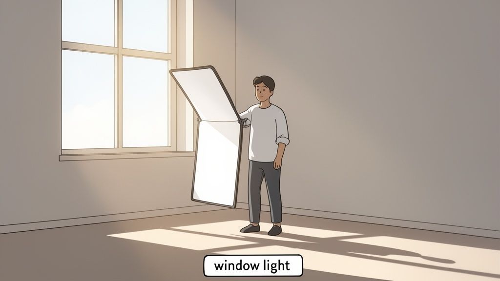
Nail Your Lighting and Composition
Okay, now that your camera settings are locked in, we can get to the fun part. This is where the real artistry comes in, and it's what separates a professional shot from a forgettable snapshot: light and composition. You don't need a fancy studio to get these right—just a good eye and a bit of creativity.
Before you even think about framing, your number one job is to find the best light. Seriously. Great lighting is the secret ingredient. Most of the time, this means walking over and switching off the overhead lights.
Lamps and ceiling fixtures often cast a harsh, yellowy glow, creating weird shadows and wonky colors. Natural light from a window? That's your best friend. It’s soft, flattering, and makes everything look clean and high-end.
Let Natural Light Do the Work
The single easiest way to level up your photos is to use a window as your main light source. Just place your subject—a person, a product, whatever you're shooting—so they are facing or angled toward the window. This wraps them in beautiful, even light that softens shadows and highlights natural textures.
For example, if you're shooting a headshot, have your subject stand a few feet from a large window. It’s a simple move that makes a world of difference. We actually have a whole guide on taking professional headshots at home that dives deeper into this.
Here's a pro tip for product shots: Grab a piece of white foam board (or even just a sheet of paper) to use as a makeshift reflector. Place it on the side of your product opposite the window to bounce light back into the shadows. This instantly creates a brighter, more balanced image.
Compose Your Shot Like You Mean It
Once your light looks good, it's time to think about composition. This is simply how you arrange everything in the frame to create a shot that’s balanced and easy on the eyes. Remember that grid overlay we turned on earlier? Now’s its time to shine.
A classic technique that always works is the Rule of Thirds. Instead of dead-centering your subject, try placing it on one of the grid lines or at one of the four points where the lines intersect. This creates a much more dynamic and interesting photo that feels professionally composed.
A few other tricks of the trade to keep in mind:
-
Leading Lines: Use natural lines in the environment—a path, a fence, the edge of a desk—to draw the viewer's eye right to your subject. It adds depth and pulls people into the scene.
-
Framing: Look for elements in the foreground that can create a natural frame. Think doorways, tree branches, or even someone's shoulder. This adds context and gives the shot a more layered, intentional feel.
-
Negative Space: Don't feel like you have to fill every inch of the frame. Leaving some empty "negative space" around your subject can make it pop and gives the whole image a cleaner, more sophisticated vibe.
When you start combining good light with thoughtful composition, you’re no longer just taking pictures—you’re crafting images. These are the skills that will consistently make your iPhone photos look less like casual snaps and more like professional work.
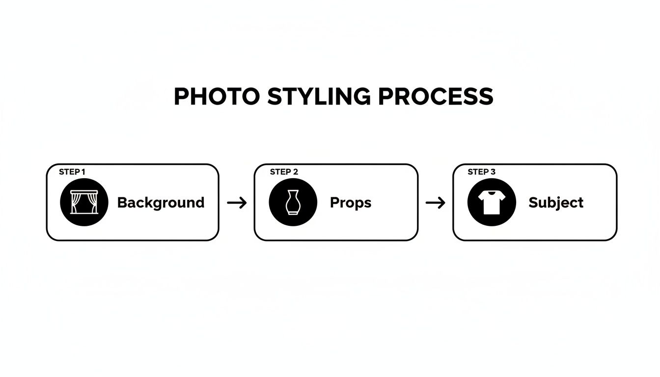
Styling Your Scene for Maximum Impact
A technically perfect photo can still fall flat if the scene itself is boring. To really make your iPhone pictures look professional, you have to start thinking like a creative director. It all comes down to making deliberate choices about your background, props, and overall vibe to tell a story.
The story starts with your background. If you're shooting products, a clean, seamless backdrop is almost always your best bet. It strips away all the distractions and puts 100% of the focus right where it belongs: on your item. You don't need a fancy studio setup for this—a large sheet of white paper from an art store or even a smooth, neutral-colored wall works just fine.
For portraits or lifestyle shots, the background's job is to add context and personality without being distracting. Think about a slightly blurred bookshelf, a cool textured wall, or a simple outdoor scene. These elements add depth and make the photo feel more authentic and less like a stiff, staged shot. The key is making sure the background complements the subject, not competes with it.
Choose Props with a Purpose
Okay, background's sorted. Now, let's talk props. The golden rule here is simple: less is more. Every prop should have a job, whether it's showing scale, hinting at how something is used, or just adding to the mood. Random clutter is the quickest way to make a great shot look amateur.
Let's say you're shooting a coffee mug for your online store. Instead of just plopping it down, you could scatter a few coffee beans nearby and add a neatly folded linen napkin. See? These props are totally relevant and help tell the story of "cozy coffee moment" without stealing the spotlight.
Think of props as supporting actors. They’re only there to make the star of the show—your subject—look even better. Every single item in the frame should feel intentional.
Build a Cohesive Brand Aesthetic
If you're a business or a creator, consistency is your best friend. Your photos are a huge part of your brand's identity, so developing a visual style that people recognize is a game-changer. This isn't just about slapping the same filter on everything; it’s about creating a signature look and feel.
Start by nailing down a few core elements:
- Color Palette: Pick a set of colors that match your brand and stick with them. This could be as simple as using similar backdrops or props that feature your brand's main colors.
- Lighting Style: Are you bright and airy, or dark and moody? Decide on a vibe and try to shoot in similar lighting conditions every time. This creates a really powerful sense of unity across your website or social feed.
- Prop Theme: Build a small "prop library" that fits your brand. If you run a minimalist skincare line, your go-to props might be simple glass trays, a few fresh botanicals, and neutral-toned fabrics.
When you put this much thought into styling a scene, your images transform from simple snapshots into polished, professional work. It’s that attention to detail that builds a strong visual identity and makes people stop scrolling.
Editing Your Photos Like a Professional
A great photo doesn't just happen in the camera. The real magic, the part that separates a good snapshot from a great, professional image, happens in post-production. This is where you bring your vision to life, refining the mood, polishing away minor distractions, and making sure the final image speaks for your brand. And the best part? You don’t need to be chained to a desktop—some of the most powerful editing tools are already on your phone.
The built-in Photos app is a fantastic starting point and, honestly, it's more powerful than most people give it credit for. Before you even think about downloading another app, get familiar with what it can do. Simple adjustments to Brilliance, Shadows, and Contrast can completely transform the depth and feel of a photo. The Brilliance slider is my go-to; it intelligently brightens up dark spots while taming overly bright areas in one move, giving your photo that perfect pop without looking overdone.
Nailing Down a Consistent Editing Workflow
If you want your iPhone photos to look consistently professional, you can't just wing it by sliding toggles back and forth. You need a process. Working through your edits in a logical order gives you far more control and ensures you end up with a clean, polished look every single time.
Here's a workflow I've honed over the years that just works:
-
Get the Foundation Right: First things first, fix the fundamentals. I always start by cropping and straightening the image to lock in the composition. After that, I’ll adjust the overall Exposure to get the brightness right and then tweak the White Balance so the colors feel true to life.
-
Dial in the Light and Shadows: With the basics handled, it's time to refine the light. I gently pull down the Highlights to bring back any lost detail in the brightest parts of the image, like a blown-out sky or a white T-shirt. Then, I’ll lift the Shadows just enough to reveal what's hiding in the darker areas without making it look washed out.
-
Refine the Color: Now we can play with color. I prefer using Vibrance over Saturation because it boosts the less-saturated colors more, which looks more natural. A little goes a long way here—oversaturated photos are a dead giveaway of an amateur edit.
-
Finish with a Touch of Sharpening: Sharpening should always be your very last step. It adds that final bit of crispness that makes an image feel professional. I always zoom in on a detailed part of the photo and add just enough Sharpening to make the edges clean, but not so much that it looks grainy or artificial.
Moving Beyond the Basics with Advanced Editing Apps
When you need more precise control, dedicated apps like Adobe Lightroom Mobile are the industry standard for a reason. In fact, a staggering 67% of professional photographers rely on Lightroom, which really shows how critical it's become. It’s a clear sign of a larger trend: powerful software, often enhanced with AI, is making studio-quality results more achievable than ever. This shift empowers creators to produce stunning, on-brand visuals without the traditional high costs.
The goal of editing isn't to completely change the photo, but to enhance what’s already there. Your edit should feel like the best version of the moment you captured, not a completely different one.
The AI-Powered Alternative for Flawless Results in Seconds
But what if you don't have the time to manually edit every single photo? What if you need professional results, right now? This is where an AI creative studio like 43frames completely changes the game.
Instead of spending minutes (or hours) tweaking sliders, you can automate the entire editing workflow. These tools instantly analyze your photo, apply professional-grade edits, correct colors, and can even swap a messy background for a perfectly clean, on-brand one in seconds.
For an e-commerce seller who needs a hundred consistent product shots by tomorrow, or a professional who needs a perfect headshot without booking a studio, this approach is a lifesaver. It’s the modern way to make your iPhone pictures look professional, fast.
If you’re wrestling with the decision between going all-in on manual editing or giving AI a try, this table breaks down the key differences.
Manual Editing vs. AI-Powered Studio
| Feature | Manual Editing (e.g., Lightroom) | AI Creative Studio (e.g., 43frames) |
|---|---|---|
| Workflow | Hands-on, step-by-step adjustments for each photo. Full creative control. | Automated one-click processing. Generates multiple on-brand variations instantly. |
| Time Investment | Minutes to hours per image, depending on complexity. | Seconds per image. Ideal for batch processing. |
| Skill Required | Intermediate to advanced understanding of photo editing principles. | Beginner-friendly. No technical editing skills are needed. |
| Consistency | Requires presets or careful manual replication to maintain brand style. | Guarantees perfect on-brand consistency across all images automatically. |
| Best For | Artistic projects, fine-art photography, and single hero images requiring a unique touch. | E-commerce, product shots, professional headshots, social media content, and marketing at scale. |
Ultimately, both paths can lead to a professional result. The manual route offers granular control for one-off creative projects, while an AI studio delivers unbeatable speed and consistency for business needs.
To see just how powerful these tools can be, it's worth exploring a free AI photo enhancer to see how it can fit into your own workflow.
Getting Your Export Settings Right for Flawless Quality Everywhere
It’s the final, and frankly, the most overlooked step in the whole process. After all that effort you put into getting the lighting, composition, and editing just right, a stunning photo can be completely undone by bad export settings. Every platform you post on has its own unique rules for image size and compression, and if you ignore them, you're asking for blurry, pixelated results.
Think about the sheer volume of images social media platforms handle. Back in 2020, an insane 95 million photos were being uploaded to Instagram every single day, with billions more on WhatsApp and Snapchat. To manage that flood of content, these platforms aggressively compress large images, which almost always means a hit to quality. You can dive deeper into the scale of mobile photography trends to see why making your work stand out is so critical.
The best way to fight back? Give them a file that’s already perfectly sized for their system.
One Size Doesn't Fit All: Customizing Exports for Each Platform
You wouldn't wear a tuxedo to the beach, right? The same logic applies here. Exporting a photo with the exact dimensions and aspect ratio for each platform ensures it shows up exactly how you want it to, keeping every bit of sharpness and detail you worked so hard on. It's how you beat the compression algorithms at their own game.
Here are a few go-to specs for the most common places you'll be sharing your photos:
- Instagram Feed: For that classic square post, 1080 x 1080 pixels is your target. It’s still one of the most effective formats on the platform. If you want a no-fuss solution, you can even use pre-made presets for an Instagram square to get it right every time.
- Instagram Stories & Reels: Go vertical with a 9:16 aspect ratio. The ideal resolution is 1080 x 1920 pixels, which completely fills the screen for a much more engaging experience.
- Shopify Product Images: Square images are the standard, usually at 2048 x 2048 pixels. This high resolution is key because it lets customers zoom way in to see all those important product details up close.
- LinkedIn Profile Picture: A clean 400 x 400 pixels is what you're aiming for. A crisp, professional headshot here makes a huge difference in your first impression.
When you export your images to these exact specs, you're essentially telling the platform, "Don't touch my photo." It sidesteps their heavy-handed compression and makes sure your work is seen in the best possible light.
My advice is to always start with your highest quality file—that edited ProRAW image is perfect—and then save a specific version for each platform. It might feel like an extra step, but it’s the one that guarantees the professional quality you've achieved is actually seen by your audience.
Your Top iPhone Photography Questions, Answered
People ask me all the time about the little "tricks" to getting professional-looking photos from their iPhones. Let's tackle some of the most common questions head-on.
Are Extra Lenses for My iPhone Worth It?
Honestly, probably not. While those clip-on lenses you see online can be fun to play with, they are far from essential for getting professional results.
I always tell people to master the fundamentals first. Getting a handle on your iPhone's built-in camera system, learning how to find and use good light, and practicing solid composition techniques will improve your photos 100x more than any accessory you can buy.
When Is the Best Time for Outdoor Photos?
This one’s easy: the "golden hours." Hands down, this is the best light you'll find all day.
We're talking about that magical first hour or so after sunrise and the final hour before the sun sets. The light is soft, warm, and hits your subject from a low angle, which creates gorgeous, flattering tones and long, soft shadows. That's how you get that incredible depth and dimension you see in pro shots.
The quickest way to get a blurry background is just to switch to Portrait Mode. For a more organic and controlled look, though, try this: put more distance between your subject and whatever is behind them. Then, move closer to your subject. This physical distance naturally creates that beautiful, soft-focus background everyone loves.
Tired of all the manual steps? 43frames is an AI creative studio that can turn your basic product shots into on-brand, professional photos in just a few seconds. You can generate your first 10 photos for free over at 43frames.com.